Trust is the bedrock of any good relationship. Just ask anyone who has ever been burned by an ex, ripped off by a once-reliable store, or ditched by a frequently-used service (I’m looking at you, Google Reader. Yes, I know it’s been three years, and no, I’m still not over it). Trust, once lost, is nearly impossible to regain.
The relationship between your users and your product is no different.
As much as you love your users, you probably know that they make snap judgments and have short attention spans. With so much competition vying for their loyalty, you can’t afford to treat trust as an afterthought in product design.
Trust needs to be ingrained in every single interaction users have with your product and brand, starting with user onboarding best practices and continuing throughout the entire user experience.
Building a trustworthy product requires laser sharp insight and smart design. Not only do you have to understand what users want out of your product, but you also have to convey that value back to them immediately.
A few common sense guidelines — be consistent, straightforward, and human — can go a long way in making your users trust your product more. Here’s why those principles work and how you can apply them to create a more trustworthy product.
Build Consistent Product Experiences
The list of places where users interact with your product is long, and getting longer — you might have different apps (web, desktop, mobile), third party integrations, phone and email support, social media, ads, landing pages, and physical products or promotions, just to name a few. Consistency across all of these touchpoints helps to ensure a smooth product experience that garners trust.
From the user’s point of view, inconsistent product experiences don’t just reveal poor planning. They point to a much more concerning problem: you might not have a strong understanding of your product's benefits and your brand's values.
Users love consistency because it conveys familiarity and effortlessness. Think of how jarring it’d be if you went into a new Starbucks and they didn’t know what a grande frappuccino was. Not only would you avoid that new location like it’s the twilight zone, but you might also reevaluate the entire Starbucks brand. Users could feel similarly peeved if your user interface varied across different features or platforms, without a clear reason.
Here are a few tips to help you design with consistency in mind.
Perform a consistency audit
Take an inventory of all the touchpoints that users have with your product, and make sure that consistency shows through in design, features and functionalities, labels, tone, and branding.
Check out Fidelity’s marketing page for one of their credit cards:

Looks fine, right? The page contains information about the card and prompts users to apply online. The layout is simple and straightforward. The credit card pictured also reflects the Fidelity brand thoroughly.
Once people start using the card, however, this is the page they use to log into their account and pay their bills:

There’s zero congruity between the two pages. To be fair, Fidelity and FIA Card Services are separate establishments, but they still could have given some indication that the product and payment portal are connected.
Make all third-party elements look native
If you’re using outside help to create experiences within your product, make sure the designs look native to your product. The experience should be so seamless from user onboarding forward that users don’t notice what’s been created in-house and what hasn’t. Don’t overlook the details either. Observant users could notice differences in styling of buttons and usage of writing style guides.
Use Simple and Clear Messaging
Avoid big words, industry jargon, and complex language if simpler language will do. Unnecessary complex language can make you come off as less intelligent, which doesn’t help build trust.
Our preference for simplicity in messaging is shallow, though pervasive. We perceive larger and bolder text to be more true than smaller and less clear text. We're more likely to trust people with easier to pronounce names. Companies with stock symbols that you can say as words, like LEAF or Southwest's LUV, do better shortly after IPO than companies with unpronounceable stock symbols.
While you don’t want to dumb down to your users, there are a few guidelines that can help keep your messaging simple and clear.
Maximize legibility and readability
Some standard practices for legibility include making your text large, having a high contrast between the text and the background, and using easy to read fonts. To improve readability, make your content easy to skim with clear headers and subheaders, and write for a middle or high school reading level. The Hemingway App is a nice tool for simplifying your writing.
To improve legibility of headlines and user comprehension, some newspapers have moved away from the traditional newspaper layout:

To a more modern, modular design:

According to one study, users found the modular design to be more "enjoyable, informative, credible, trustworthy, interesting, clear, and easy to navigate."
Don’t substitute simplicity for substance
In Thinking, Fast and Slow, Daniel Kahneman discusses ways to create persuasive messaging with the disclaimer:
“All this is very good advice, but we should not get carried away. High-quality paper, bright colors, and rhyming or simple language will not be much help if your message is obviously nonsensical, or if it contradicts facts that your audience knows to be true.”
It’s not about tricking users. It’s about making sure that a good, honest message comes off as such.
Don’t Let Your Product Overshadow Your People
When designing a new technology, there might be a temptation to show off all the cool stuff your product can do. While users might be wowed by your features, they’ll trust your product more if they know that it’s backed by real, relatable, and nice people.
Three out of ten of the Stanford Guidelines for Web Credibility, which were developed in the early 2000’s, have to do with people. We’re even more connected online today, and not having people stand behind your product could be a red flag. Even the CIA tries to put some faces to their organization.
Below are some ways to flaunt your team and foster stronger, more human connections between your product and users.
Invest in your team page
A “meet the team” or “about us” page not only shows off the expertise on your team, but it also gives you a chance to have some personality. Good team pages can include employee pictures and their hobbies, skills, and social media profiles. You can get creative with illustration, if that complements your brand. The designers at Pulpfingers do this in a fun way that grabs your attention:

Don’t over-control your team for the sake of consistency
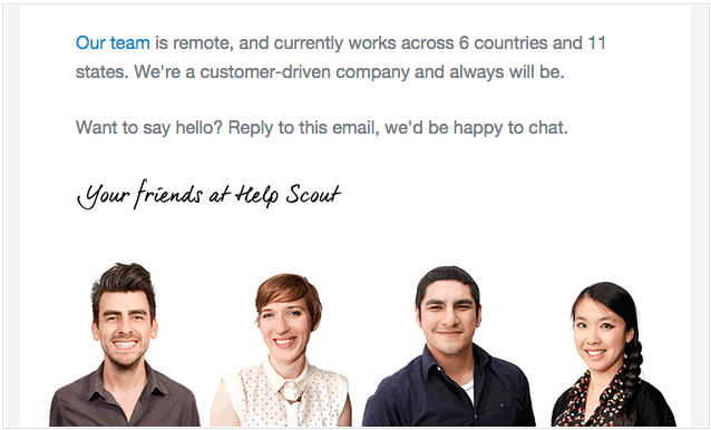
Some organizations might try to exert more control as a way to minimize the inconsistency of humans, but this can lead to boring and overly corporate customer interactions. As a remote team focused on customer support, Help Scout does a great job of emphasizing their team’s global diversity and showing the people behind their product:
Trust is all about the long game
There are countless points of engagement that could affect whether or not users trust your product, from user onboarding best practices to user engagement and furhter on. Users who develop trust issues won’t stay users for long.
Using research to understand how people perceive trustworthiness can help guide product design and ensure that you’re not unintentionally coming off as unreliable.
Building a trustworthy product also helps you think about longer term strategy. While your product may change as your company grows and your users’ needs evolve, trustworthy brands are resilient and continue to create champions out of users. Investing in trust early on will better help manage future growth.