Product tours (or product walkthroughs) introduce new users to apps by giving them the lay of the land. You can think of them like interactive tutorials—they help users get comfy with your UI while guiding them to the core processes that bring value to your product. Great product tours set users up for long-term engagement and increase the odds of product activation, product adoption, and user retention.
If you want to keep new users as customers, your product has to work seamlessly from the start —and there’s no better retention mechanism than a stellar product tour.
What is a product tour?
A product tour is a guided walkthrough of a product or service, typically presented to users after they sign up or first log in. Product tours are used to onboard new users, introduce them to a product's key features and value, and help them get started using it. They’re different from product demos, which intend to show a custom solution to a specific user need.
Why use a product tour?
You should expect adopting any new software to come with a bit of a learning curve. A product tour helps users navigate this friction while promptly revealing an app’s important value-laden features. Good tours walk a tightrope between annoying users with over-engagement and frustrating users with under-assistance.
They act as a guided tour for new customers learning how to use your SaaS product for the first time. Product tours:
- Compel users to take specific, meaningful actions in your app. Instead of leaving users to figure out your app on their own, product tours influence user behavior by explaining why each step is important and guiding users to take critical actions within your product.
- Guide users toward their aha moment. An aha moment is when users first realize the value that your product provides. Users who stumble upon their aha moment understand how your product improves their work (or life). This isn't always something they'll discover on their own—but a product tour makes that discovery process a heck ton easier.
- Can be simple to build and experiment with. Tools like Appcues allow you to create or amend a product tour without making software changes within your app. This makes experimenting with your onboarding process a breeze and quickly uncovers what resonates with your users.
ONBOARD SMARTER
Ready to tour Appcues' product tour software?
- Use in-app guides to educate users
- Increase activation with personalized flows
- Drive feature adoption to improve stickiness

10 tips for building successful product tours
Every product has different features, and every user has different needs—that’s why effective product tours look different for every app. That being said, here are 5 best practices for designing a great product tour that moves users through your flywheel and onto the next stage in their journey.
- Be sequential: Don't just show users a random collection of tooltips without any clear structure. Each step in your product tour should be clearly defined, and each step should move users further down the path to activation.
- Focus on the core value: Explaining every little feature will only lead to frustrated and annoyed users. Make sure you're only highlighting necessary features users need to experience your product's core value to keep them truckin' along to their aha moment. (You can always introduce additional features later.)
- Keep things short and sweet: New users are keen to get started using your app. Respect their time by making sure your tour is brief. Unnecessary steps add unnecessary friction to the onboarding process. Less is more—and three to five steps are usually plenty for an onboarding flow.
- Provide clear next steps: The best product tours clearly explain the next step a user should take. How do they begin adding their data? Do they need to sign up for a paid subscription first? Users can’t take the next step without first knowing where to start, so show them!
- Make sure to provide further help: A successful product tour will improve customer success. This means you must stay on top of users’ progress with your product features. Provide links to additional content, interactive guides, and access to real-time customer support as they continue to explore your app. And let them know where they can go to find the product tour if they need to walk through a step again.
- Personalization is key: Think of your product tour as a personal guide tailored to each user's needs. It's not about one-size-fits-all—it's about fitting like a glove. Segment your tours based on user roles or behaviors. This way, a newbie gets the beginner's introduction, while the seasoned user gets the advanced tips. It’s like having a personal shopper—they know just what you need.
- Keep your tours up-to-date: Your app evolves, and so should your product tours. Regularly review how your tours are performing. Are users dropping off at a certain point? Maybe that step is the equivalent of a party guest who overstays their welcome. Update and tweak your tours based on user feedback and engagement data. It's like keeping your playlist fresh—nobody wants to hear last year's hits at this year's party.
- Monitor user engagement: Keep an eye on how users interact with your product tours. Use analytics to understand where they find value and where they don’t. Think of it as being a good host at a party—you want to make sure everyone's having a good time, and if they’re not, you change the music.
- Constantly seek feedback: Encourage users to give feedback on your product tours. It's like asking your guests for their favorite dessert recipes—it helps you serve up exactly what they want next time. This input can be invaluable in refining and improving the user experience.
- Offer a ‘skip’ option: Not everyone wants the grand tour. Some users might want to dive right in. Respect their familiarity and confidence with a ‘skip tour’ option. It’s like offering a self-service buffet alongside a sit-down meal. Everyone gets to enjoy their experience in their own way. Plus, this flexibility can prevent user frustration and keep the experience positive.
Andrew Capland, PLG Advisor and Growth Leader, gives us a bit of insight into how he's structured product tours:
"The main challenge with product tours is that most display 1x (usually when the page/feature loads for the first time) and then disappear forever. That's challenging because many users want to explore on their own first - then have guidance later. With that in mind, I've found the best tours can be minimized and then viewed when the user is ready. Ideally, combined with a checklist or "getting started" page. Something that provides help when they need it - on their terms."
While there's no one-size-fits-all best product tour format, there are best use cases for onboarding flow design patterns; using UI patterns like tooltips, hotspots, and modal windows engages users and educates them on how to use your product.
Types of product tours
Crafting an engaging product tour is a bit like hosting a lively party—every element should spark interest, guide your guests, and make them feel right at home—and remember, variety is key. Here’s a roundup of the different UI patterns you can mix and match for your product tour. Think of these as your party essentials, each bringing its unique flair to the event!
- Pop-ups: Pop-ups are like those friendly neighborhood billboards, popping up at the right moment to highlight the good stuff. They range from simple splash screens to modal windows demanding a bit of action. Think of them as your app's way of saying, "Hey, check this out!" They're quick, effective, and get the message across without much fuss.
- Interactive walkthroughs: Imagine having a savvy friend guide you through a new city. That's what interactive walkthroughs do for your app. They're like personal tour guides for users, showing them the ropes step-by-step, making even the most complex processes feel like a walk in the park.
- Hotspots: Hotspots are the subtle nudges in your app that say, "Psst, look here." These little beacons of wisdom draw users to specific points, perfect for highlighting updates or tucked-away features. They're like the hidden gems of your app, waiting to be discovered.
- Tooltips: Tooltips are the whisperers of the app world. They hover around, offering nuggets of wisdom about features or elements, without pushing users to act. They're there to inform and enlighten, offering insights in bite-sized pieces.
- Explainer videos: Combine the charm of a good story with the clarity of a demonstration, and you get explainer videos. They're like mini-movies for your app, greeting new users with a visual feast that walks them through your app's coolest features.
- Task lists: These are your app's to-do lists, guiding users through tasks with a clear sense of direction and purpose. They're like breadcrumbs leading to the heart of your app, ensuring users don't miss out on anything important.
- Progress bars: Like mile markers on a road trip, progress bars show users how far they've journeyed in your app and how much more adventure lies ahead. They're a visual pat on the back, encouraging users to keep going and explore all that your app offers.
No matter the mix, the aim is the same: engaging users in a journey of discovery through your app. It's about making learning interactive, fun, and effective for all types of users.
How to choose the right UI pattern for your product tour
Selecting the right UI pattern for your product tour is like picking the right music for your party—it sets the tone and keeps the vibe just right. Here’s how to ensure you’re making the best choice for your users:
Assess your app’s complexity
Just like a complex dish needs more detailed instructions, a complex app requires more comprehensive guidance. If your app is a multi-layered lasagna, packed with features and intricacies, you'll need a full-on guided tour to help users digest it all. But if it's more like a simple, yet elegant bruschetta, a few tooltips or hotspots might suffice.
Below you’ll see how Zenefits uses a blend of modal windows and tooltips to smoothly guide users through its HR platform. It’s a perfect example of matching the tour complexity with the app's nature.
Know your audience
Just as a good host knows their guests' tastes, understand who your users are. Are they digital natives who navigate apps like a fish in water? Or are they folks who might need a bit more hand-holding?
It's important to match the UI pattern you choose with the needs of your users and the requirements of your app. More complex apps might require more targeted onboarding guidance, while straightforward apps might only require basic tips.
You should also think about your users' motivation. How likely are they to complete a more extensive product tour? How tech-savvy are they? It's important to empathize with users as you choose which UI pattern to apply to your product tour.
These are the 3 most popular UI patterns for building product tours:
If your users are like tech-savvy partygoers, a light touch with hotspots or brief tooltips, much like Asana's "Add New" button highlight, could be the way to go.
For those who are more like first-time guests in the digital world, consider a more structured approach with interactive walkthroughs or even explainer videos. Remember, it's all about making your guests feel at home.
Align UI patterns with user motivation
Think of this as choosing the right music for your party. How engaged are your users likely to be? Are they ready for a deep-dive tour, or would they prefer the highlights? This is where you gauge the room's mood.
If your users are eager learners, ready to explore every nook and cranny of your app, then a detailed tour with progress bars or task lists might be the ticket. But if they're only popping in for a quick visit, a simple tooltip or a brief explainer video might be the better choice. It's about reading the room and adjusting the volume accordingly.
3 amazing product tour examples
There’s no better way to level up your product tour game than looking at great examples in action. Here are several of the best IRL product tour examples and product walkthroughs that set the bar for what you can achieve.
Mint

Personal finance management app Mint built its product tour to guide users through a lengthy setup process that involves everyone’s favorite task: typing in sensitive personal information. Mint uses tooltips to make what would otherwise be a thorny starting process a cinch.
After entering their email address, Mint asks users to add all of their bank accounts. Mint knows that most people don’t enjoy tracking down all of their financial information and giving it to a private company, so they include a reassuring sidebar on the right side of the screen to build trust with users. The sidebar includes a checklist of the steps required to get started, while including blurbs highlighting its dedication to security and the trust of its millions of clients.
After that, Mint liberally uses tooltips to point out the most important features within the app. The tooltips employ bold colors to contrast against the rest of the UI. It also includes CTAs and options for more information for users who want to engage with the feature immediately. For everyone else, the “Next Tip” button stands out brightly against the dark gray tooltip.


Mint’s tooltips also employ the use of gentle animations to further draw attention to its onboarding tips.

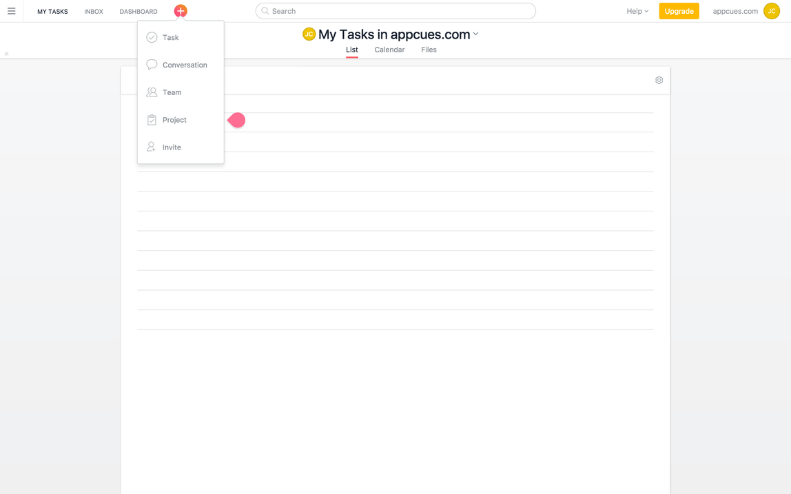
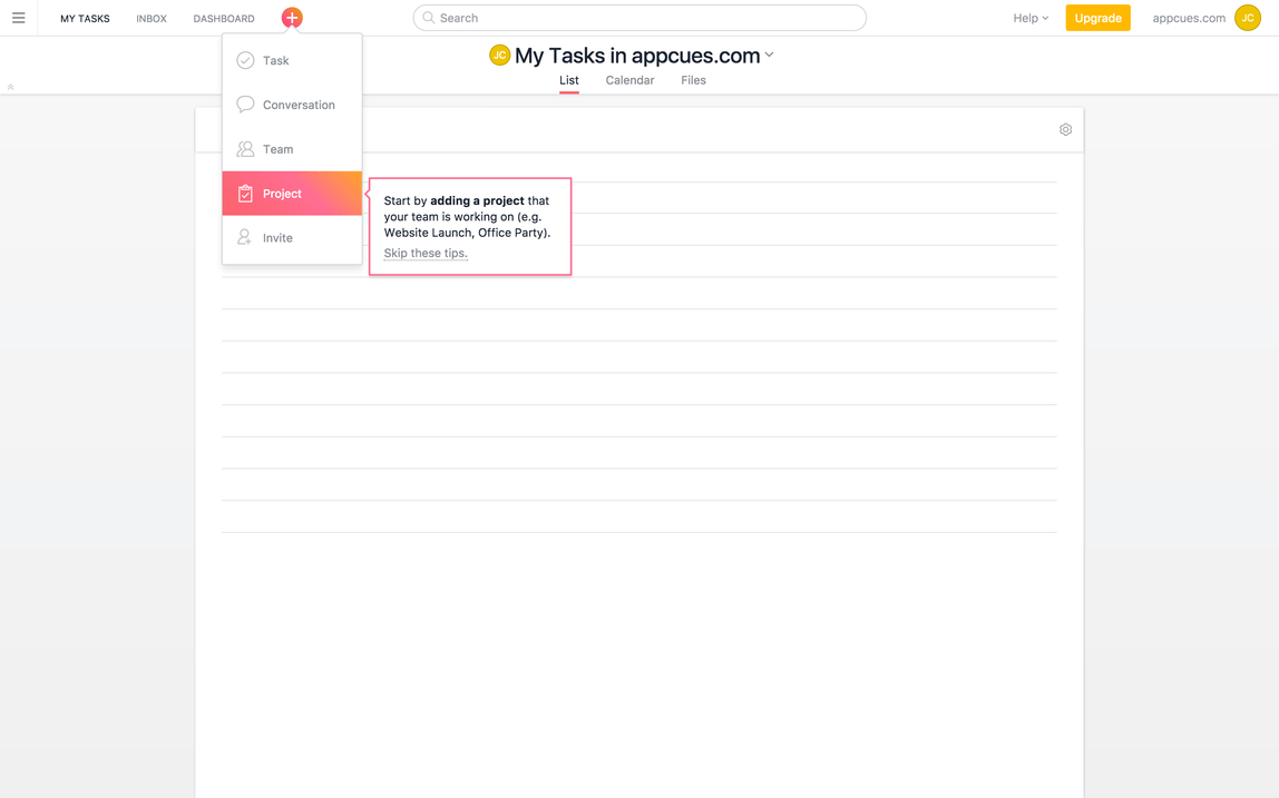
Zenefits
HR platform Zenefits uses a combination of modal windows and tooltips to acquaint users with its app. Its product tour funnels users to a demo version of its platform that allows them to learn about and engage with important features before venturing off on their own.
First, Zenefits uses modal windows for users to input the information required to get started.

Another modal window then informs the user that they’ll be working inside a demo version of the software. It also uses this as an opportunity to have users review its Terms and Privacy policy.
.png)
From here, Zenefits guides users from function to function with the use of tooltips. The tooltips point directly to the features mentioned in the copy. The product walkthrough thoughtfully includes a “Back” button within each tooltip in the event a user accidentally hits the “Next” button.

Zenefits also grays out the area behind the tooltip and feature to emphasize the feature’s location within the UI.

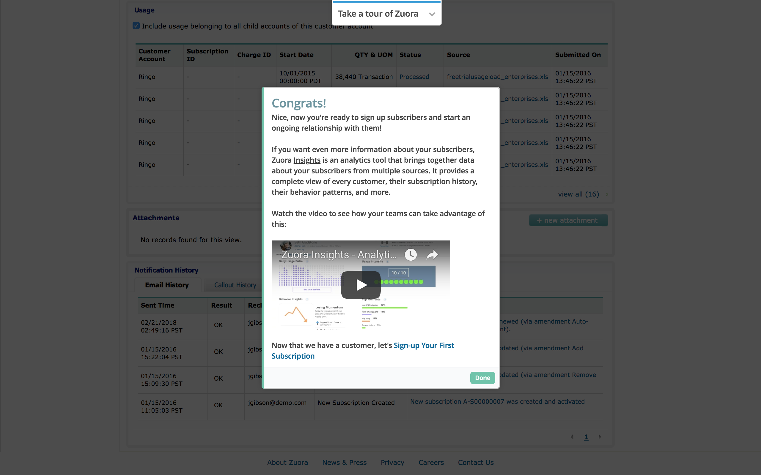
Zuora
Product tours should stay short to retain users’ attention, but sometimes complex products require more guidance. Enterprise software company Zuora bills itself as an “all-in-one” solution. It offers a full stack of subscription management tools to stand out from competitors. Users must understand how to work every tool in its stack to see the full benefit of the product. This means its product tour runs long by most standards.
Zuora solves this problem through the smart use of modal windows. Early in the product tour, new users select whether their interest in the app concerns “Product & Growth” or “Finance & Accounting.” This allows Zuora to immediately introduce users with targeted in-app messaging to the features that brought them to the product in the first place.

Zuora uses tooltips as the framework for most of its product tour. Too many tooltips will disengage readers and can lead to customers clicking “Next” without reading anything. Zuora throws in a few action-driven tooltips to prevent this from happening:

It wraps up its lengthy product tour with a modal window congratulating the user. This final modal contains a video that allows curious users to find more helpful information on how to use the product to get results. Users who’ve seen enough can click the “Done” button in the bottom right corner.
4 best product tour software to consider
There are plenty of free, paid, and open-source tools to build modal windows, tooltips, and more for your product tour or walkthrough. It's great to have options, but the reality for most SaaS companies is that building your own product tour from scratch isn't cost-effective. This rings especially true once you factor in the costs of maintenance and iteration. Instead, consider using dedicated tour-building software to build your product tours. Such platforms are usually more efficient, easier to use, and less expensive in the long run than their alternatives.There are many platforms out there that can help you build a user-friendly product tour, including:
Appcues
Of course, we're biased! But Appcues has nearly a decade of experience in the product tour space. Companies like Amplitude, Heap, and Hotjar use Appcues to enhance their user onboarding and product experience. Its easy-to-use tour builder allows you to create pleasing walkthroughs without getting bogged down in coding. Tooltips, slideouts, hot tips, and modal windows can all be constructed in Appcues and implemented across tours and flows. It’s the premier tool for companies looking to enhance their product tours or build their first one from scratch.
Consider Appcues for its:
- Array of UI patterns
- Easy installation
- Code-free tracking and powerful analytics
- Many integration options, including Salesforce, Slack, and Mixpanel
- Mobile app support
Check out this step-by-step guide to creating interactive product tours in Appcues quickly and efficiently.

Pendo
Pendo allows you to create product tours across your website and mobile apps. Its UI pattern toolbox includes banners and lightboxes to add flavor to your walkthroughs. Its analytics functionality is powerful and works well for product managers whose interest in analytics capabilities exceeds their need to improve the user experience.

Userpilot
Userpilot is another popular option for product tours. You can build tooltips, checklists, and more using its no-code builder. Userpilot backs its tour-building features with analytics tools to help segment users and test flows for optimized performance, though these features are not as robust as some of its competitors.

Level up your product tours
Remember that no one experience fits every customer’s needs. Just like your product, your tour should evolve based on user feedback and changing needs. Your returning customers, for example, will appreciate tours that recognize their familiarity, offering them new insights instead of a repetitive run-through.
The key to a successful product tour is continuous improvement. You’re in the unique position of knowing your product intimately, but stepping outside that familiarity is crucial, and seeing the tour through your users' eyes is even more crucial.
Use tools like A/B testing, usability tests, microsurveys, and product metrics to fine-tune your approach. This isn’t only about making your tour better—it’s about making it the best it can be for every user, every time.
And if you’re hungry for more insights on crafting standout product experiences, we’ve got just the thing. Dive into our collection of wisdom with 20 Proven Strategies for Creating More Impactful Product Experiences. This guide is your next step towards mastering the art of engaging and effective product tours.
Customers returning to your product after some time away won’t want to watch a full-fledged product tour again. It’s worth creating different product tours for unique user segments to provide more personalized and pleasing UX.
And one final piece of advice: test your product tours thoroughly. You and your team know your product inside and out, so your experiences with your product are inherently biased. Employ A/B testing, usability tests, micro surveys, and track product metrics to optimize your tour experience and balance between being helpful without being obtrusive.
FAQs
How do I make a product tour?
Creating a product tour is like crafting a story—it needs a beginning, middle, and end. Start by identifying the key features and functionalities you want to showcase. Use a tool like Appcues to build the tour without heavy coding. Keep it interactive, simple, and focused on delivering value. Test it out, gather feedback, and don’t be afraid to iterate.
How effective are product tours?
Product tours can be incredibly effective if done right. They're like the friendly neighborhood guide who helps new residents settle in. A well-designed tour can boost user engagement, increase product adoption, and reduce time-to-value. However, their effectiveness hinges on their relevance, brevity, and clarity.
How do you improve a product tour?
Improving a product tour is like tuning a musical instrument—it requires attention and regular adjustments. Use analytics to understand where users drop off or engage the most. Personalize the tour for different user segments, and always allow for feedback. Keep the content updated, and ensure that the tour aligns with your product's new features.
What are product tour trends to watch?
Some product tour trends to keep an eye on include increased personalization, the use of AI and machine learning for more dynamic tours, integration of multimedia elements like videos and animations, and the rise of mobile-friendly tours. Also, watch for more immersive experiences, like augmented reality tours, as technology evolves.
What is a product walkthrough?
A product walkthrough is a step-by-step guided tour within an application, designed to familiarize users with its main features and functionalities. It's like having a knowledgeable friend walk you through a new device, ensuring you know all the cool things it can do and how to use them.
What is a feature tour?
A feature tour focuses specifically on showcasing the features of a product. It's more detailed and feature-centric than a general product tour. Think of it as a highlight reel for your app, spotlighting each feature with explanations and demonstrations, helping users understand and utilize your product’s capabilities to the fullest.